
-
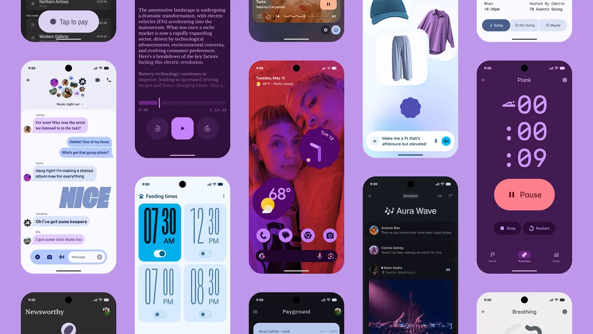
Google I/O 2025 Recap: Gemini 2.5, Project Astra, and the Future of AI-Powered Everything
Google I/O 2025 was all about AI—everywhere, in everything. From the powerful new Gemini 2.5 model…
-
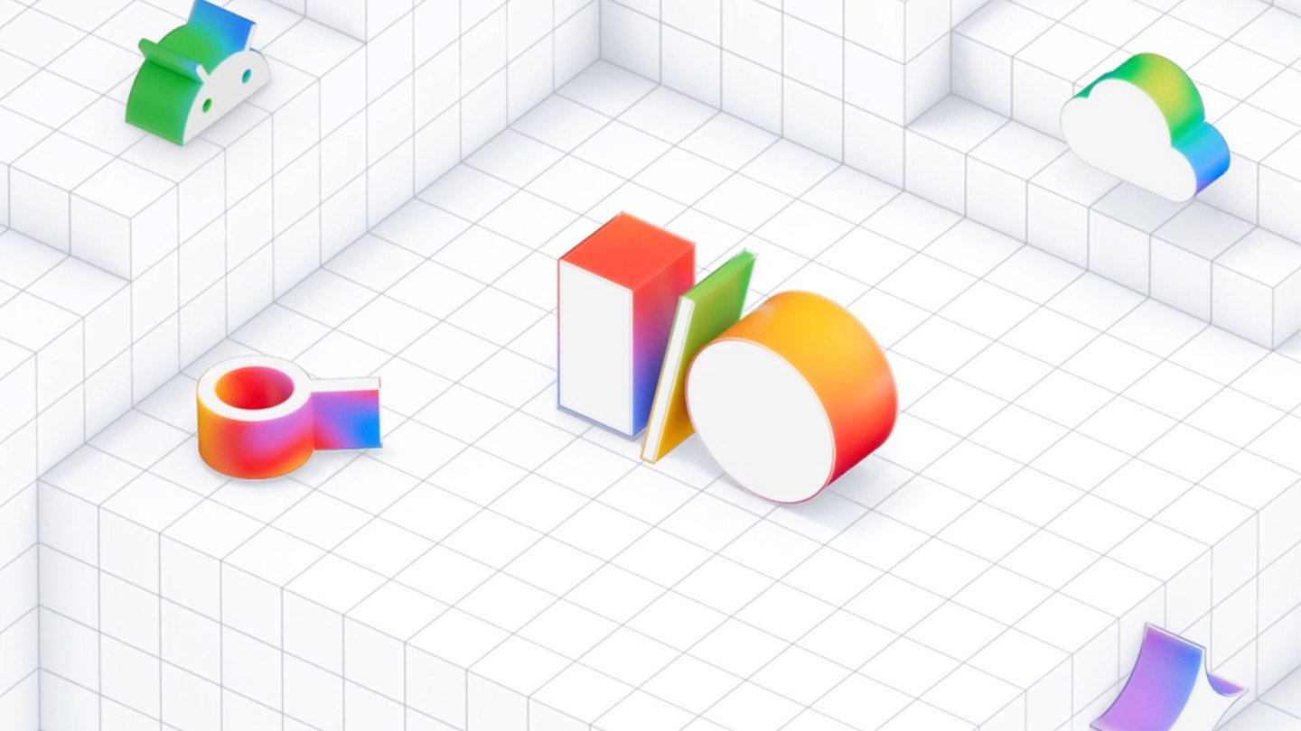
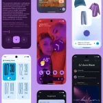
Discover Material 3 Expressive: Google’s Bold New Take on UI Design
Google’s Material 3 Expressive is a bold new design style that brings personality, vibrancy, and flexibility…
-
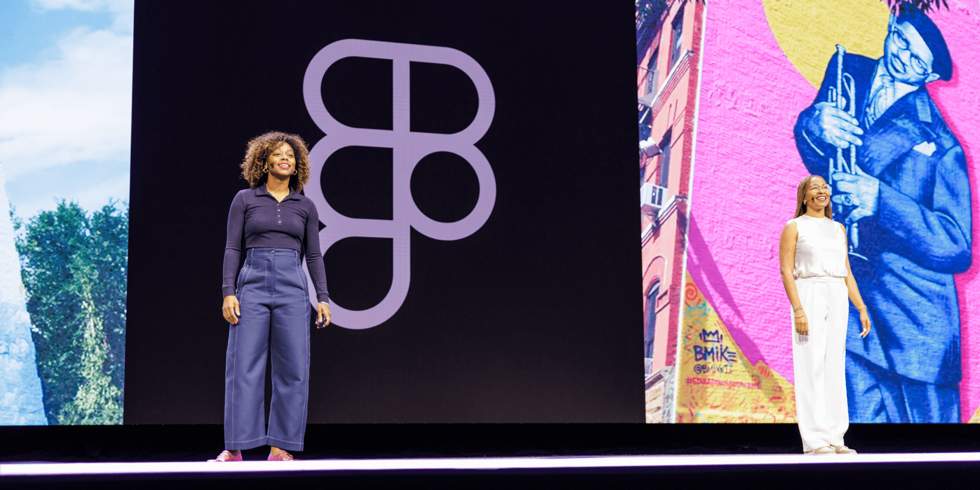
Config 2025 – Day 3 Recap: Reflecting on a Transformative Conference
Day 3 of Config 2025 wrapped up with thoughtful reflections, deep dives, and hands-on exploration of…
-
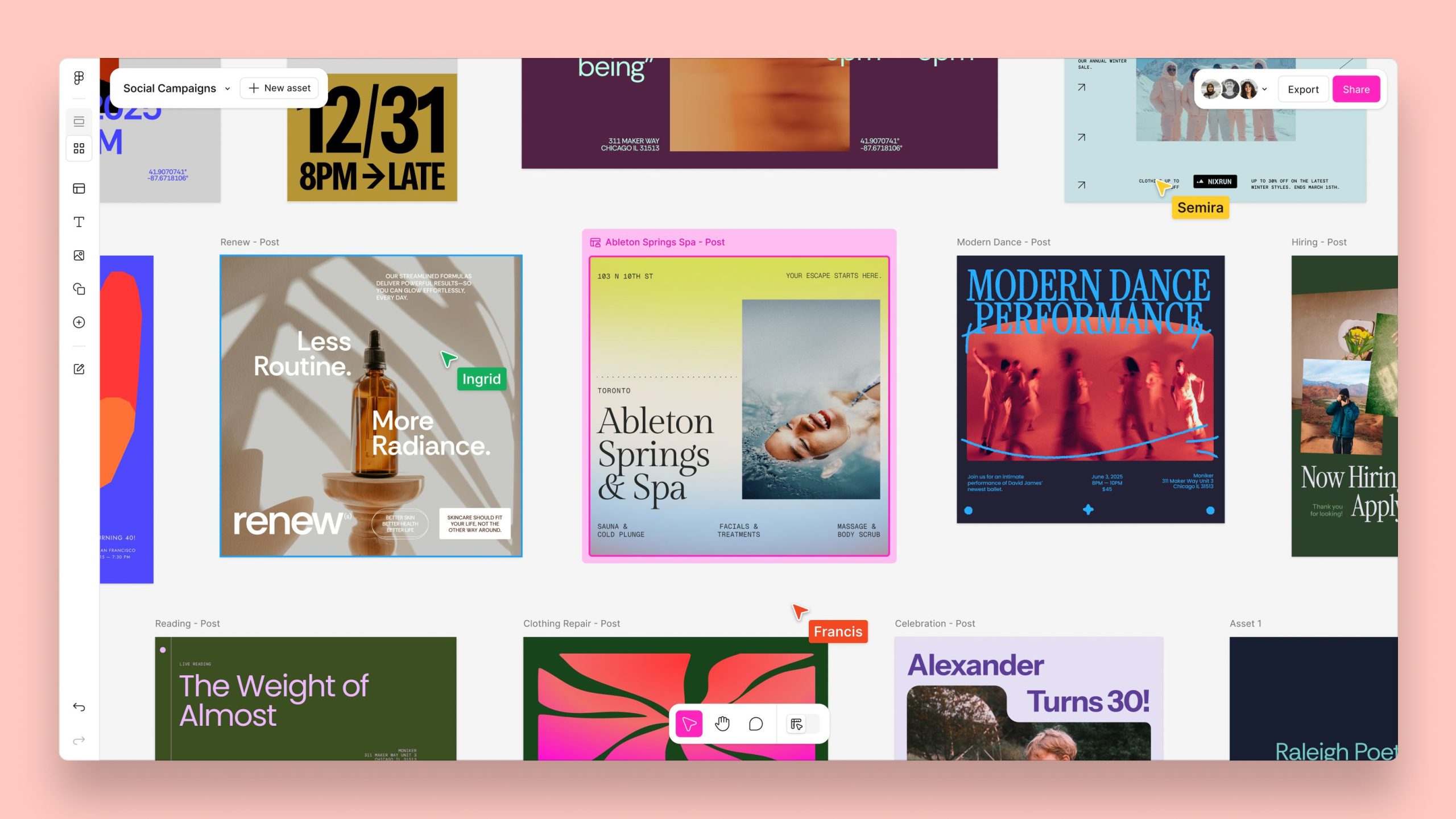
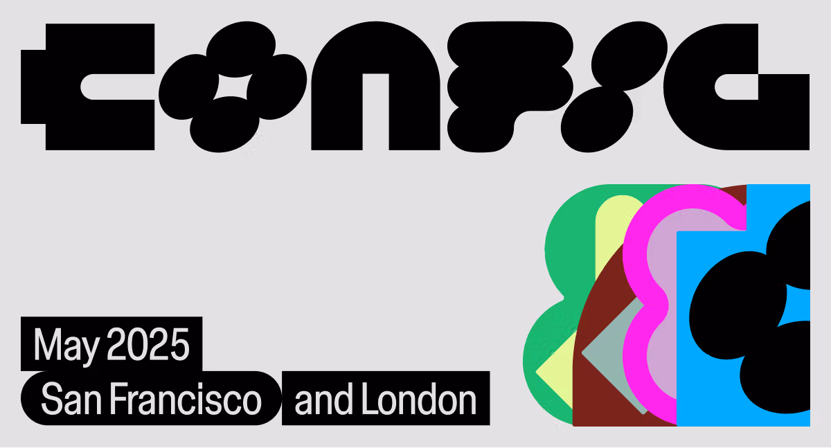
Config 2025 – Day 2 Recap: Figma’s Bold Leap into AI and Beyond
Figma Config 2025 Day 2 was packed with game-changing announcements — from AI-powered prototyping with Figma…
-
Figma Config 2025 – Day 1 Recap: Innovation, Inspiration, and Community
The doors to Config 2025 opened today at the Moscone Center in San Francisco, marking the…
-
Mastering the Art of Font Pairing: A Guide for Designers
Pairing fonts effectively is a powerful skill that can elevate your designs from ordinary to extraordinary.…
-
The Power of Minimalism in Design: Less is More
Discover the art of less with minimalist design. Learn how to create clean, impactful visuals that…
-

Welcome to Artboard Design: Where Creativity Meets Strategy
Hi everyone, and welcome to the first ever blog post for Artboard Design! We’re thrilled to…
Latest Posts
- Google I/O 2025 Recap: Gemini 2.5, Project Astra, and the Future of AI-Powered Everything

- Discover Material 3 Expressive: Google’s Bold New Take on UI Design
- Config 2025 – Day 3 Recap: Reflecting on a Transformative Conference
- Config 2025 – Day 2 Recap: Figma’s Bold Leap into AI and Beyond

- Figma Config 2025 – Day 1 Recap: Innovation, Inspiration, and Community